
TIMELESS TOUCH AESTHETICS CLINIC.
WHERE CLINICAL CARE MEETS JOYFUL ARTISTRY.
For the launch of a new beauty aesthetics clinic in Toronto’s vibrant Kensington Market, the brief was to create a brand identity that could hold two seemingly opposite ideas in perfect harmony: the sterile precision of clinical care and the soulful warmth of holistic, natural wellness.
My role was to design the clinic’s logo and provide foundational branding support for the website and social media launch. The solution is a mark that embodies balance with timeless elegance. Two mirrored ‘T’s form a diamond, creating a symbol of unity and structure. To bring warmth and artistry into its clean geometry, I hand painted a soft pink watercolour wash, then digitized and vectorized it in Illustrator. This handcrafted element infuses the brand with a human touch and a sense of artistic expression.


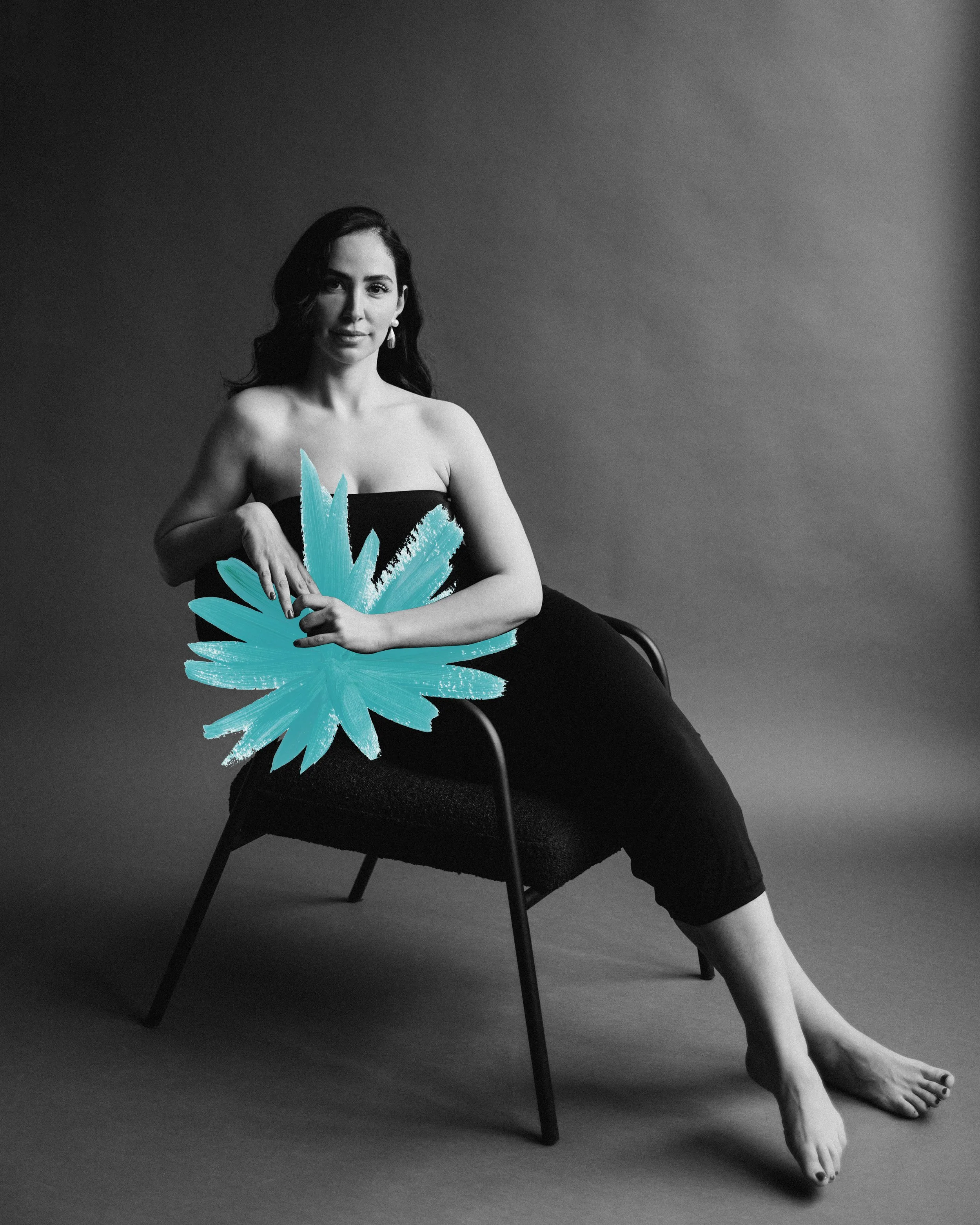
To build out the brand world, I developed a custom colour palette to evoke a sense of serene yet confident femininity. The palette is led by Pink Quartz Glow, a soft pink derived from the logo’s watercolour accent. Supporting it are Ethereal Chamomile, Rainee Sage Green, and Ocean Breeze, representing earthy tones that root the brand in nature and holistic wellness. Together, this curated collection of colours creates a refreshing and sophisticated environment for the clinic.
In a crowded market of trendy aesthetics clinics, the result is a brand that feels both authentic and timeless. It is trustworthy yet inspiring, celebrating beauty in all its diverse, radiant forms.
(Photography by Mari Nomad.)