VICTORIAN TRADE CARDS.
I love finding unique vintage pieces that carry a story. What may seem like simple printed pieces are actually some of the earliest expressions of advertising — blending art, storytelling, and persuasion in sophisticated ways. From educational content to collectible formats, Victorian Trade Cards bring to light how deeply rooted the fundamentals of our industry are. While technology has transformed how we communicate, the fundamentals of visual persuasion are the same.
Part of what makes these cards more accessible than we might expect was their secondary purpose as collectibles. Paired with the rise of mass-produced lithography at the time, these cards were widely distributed yet intentionally designed to be saved. People would often preserve them in scrapbooks, turning advertising into something worth keeping.
Liebig’s Fleisch-Extract
1
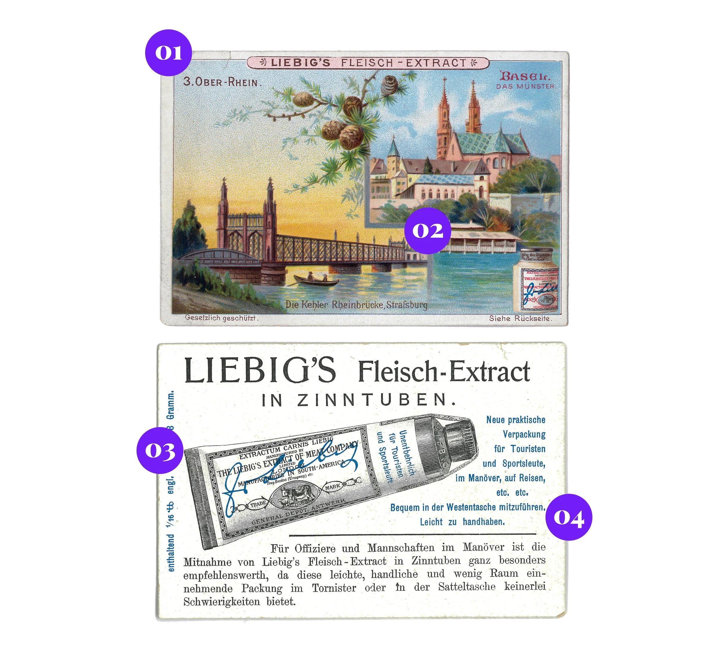
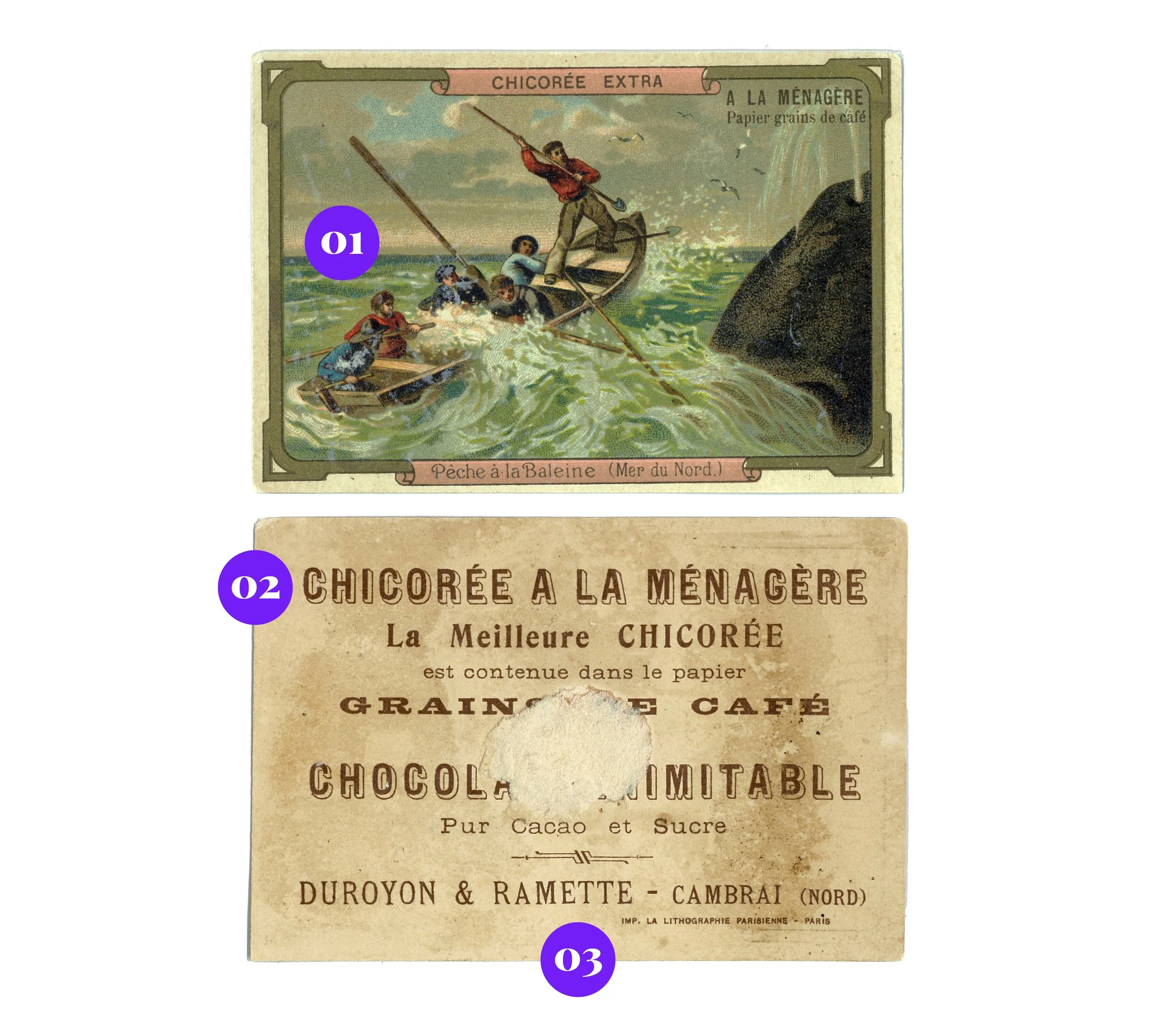
It’s a collectible. Each card depicting a unique scene turned advertising into a keepsake. Card #3 features the Upper Rhine River.
2
Educational content. Unique scenes sold European culture and geography as marks of sophistication.
3
Visual recognition. A drawing of the new tube packaging was essential for quick identification on store shelves. See the original packaging on the front.
4
Strategic transparency. Gets straight to the point by identifying its niche audience (soldiers + travellers).
Dr. Thomas’ Eclectric Oil
1
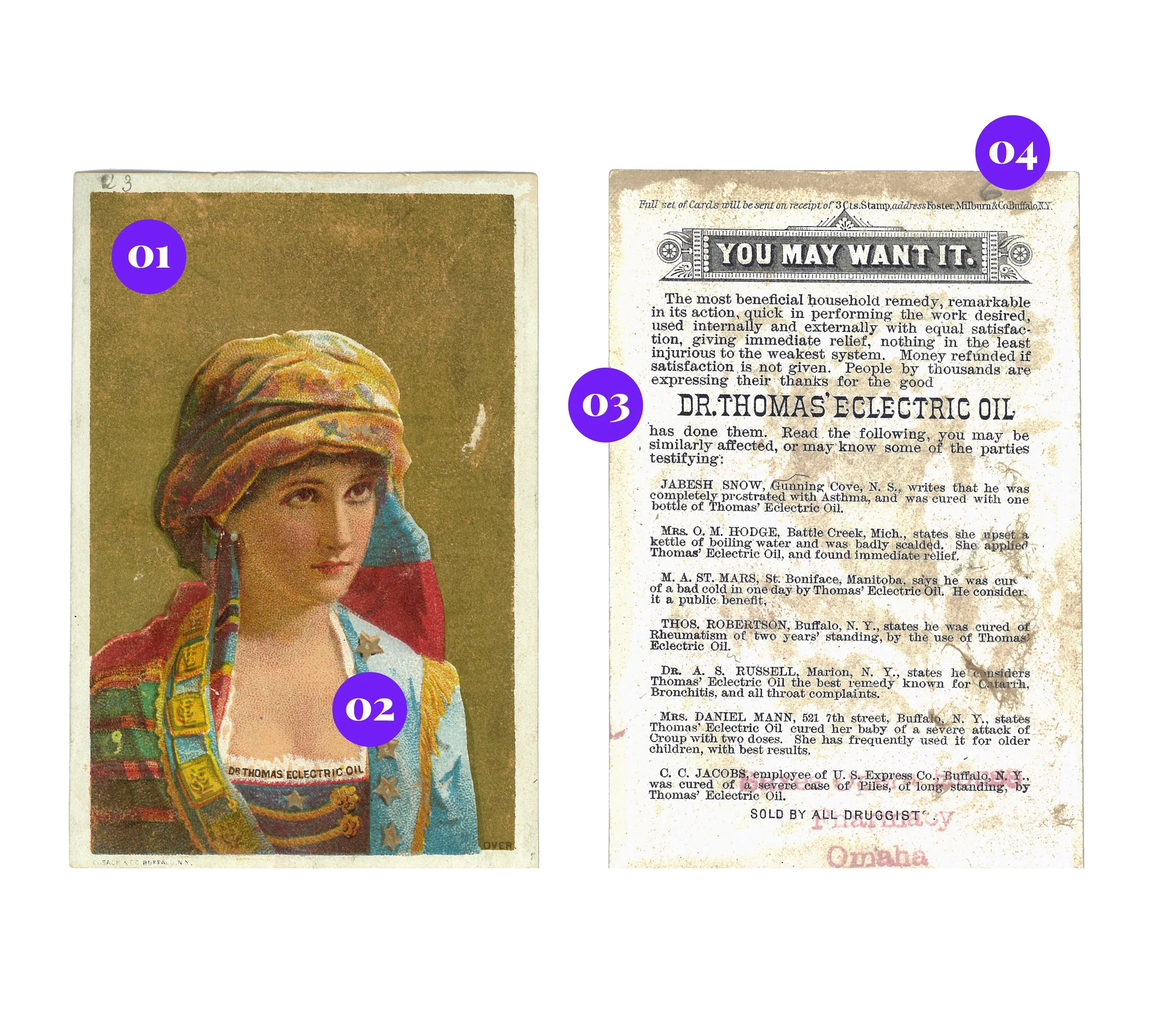
Printed to dazzle. Gold, more expensive than standard colours, was used to signal luxury and confidence in the product’s superiority.
2
Selling aspiration. Sell the feeling of youth, beauty and health, not the product. (Notice the discreet product name on the woman’s clothing.)
3
You will want it! The origins of customer reviews —unverified, urgency-driven, and born from medicinal quackery. The cure? The Pure Food and Drug Act.
4
Collect them all! Sending in 3 cents by mail secured the full collection while generating an action-driven lead.
Chicorée Extra
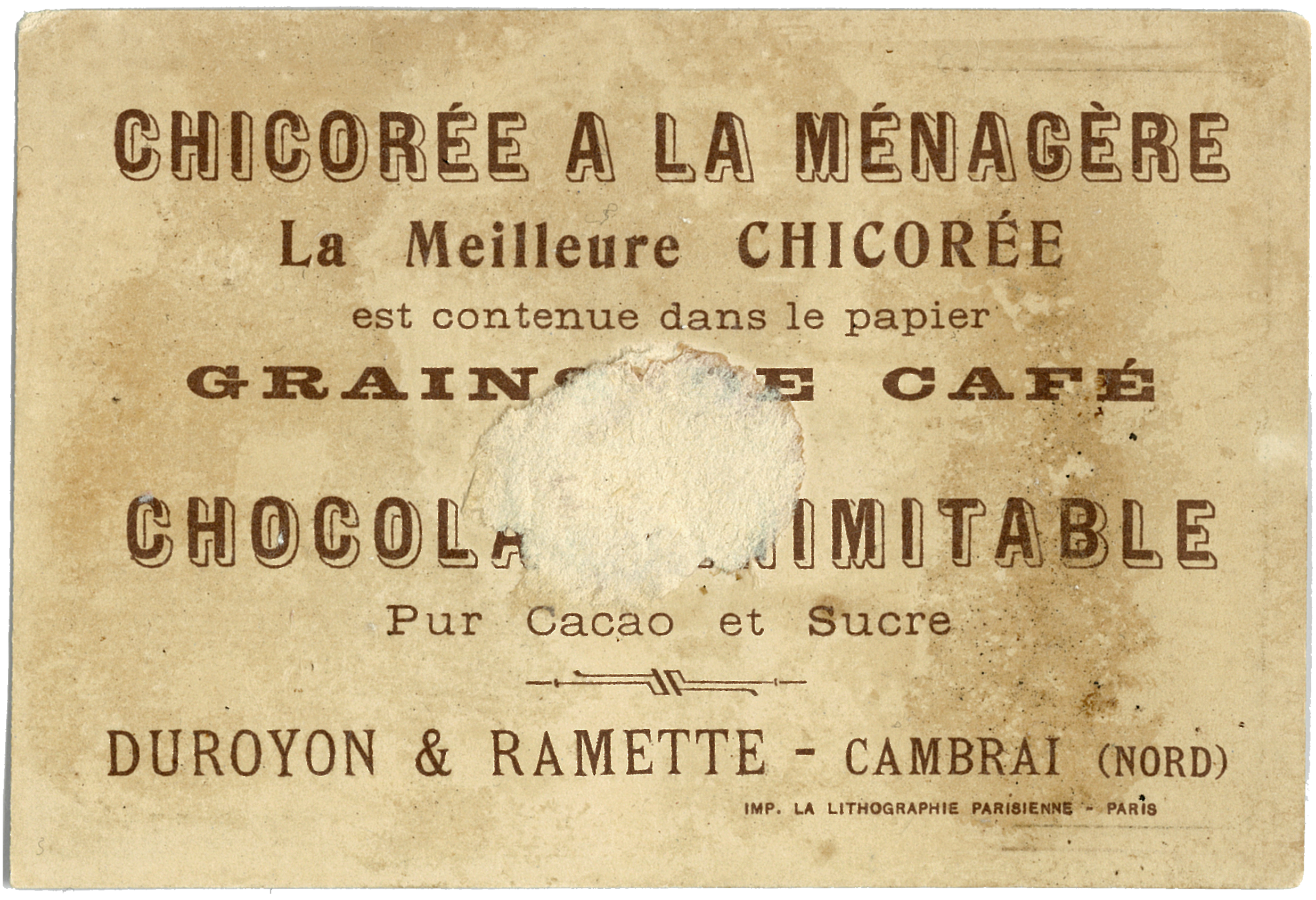
1
The dramatic scene. Intrigue matters more than the product itself. The unrelated whaling imagery is highly memorable, still achieving strong brand recall.
2
Breaking the rules. Fonts, weights, and sizes galore, yet the hierarchy looks flawless. Strict typographic consistency seems to be a modern invention.
3
Premium sourcing. In a competitive market, highlighting manufacturers and product quality was essential to convey value and drive sales.
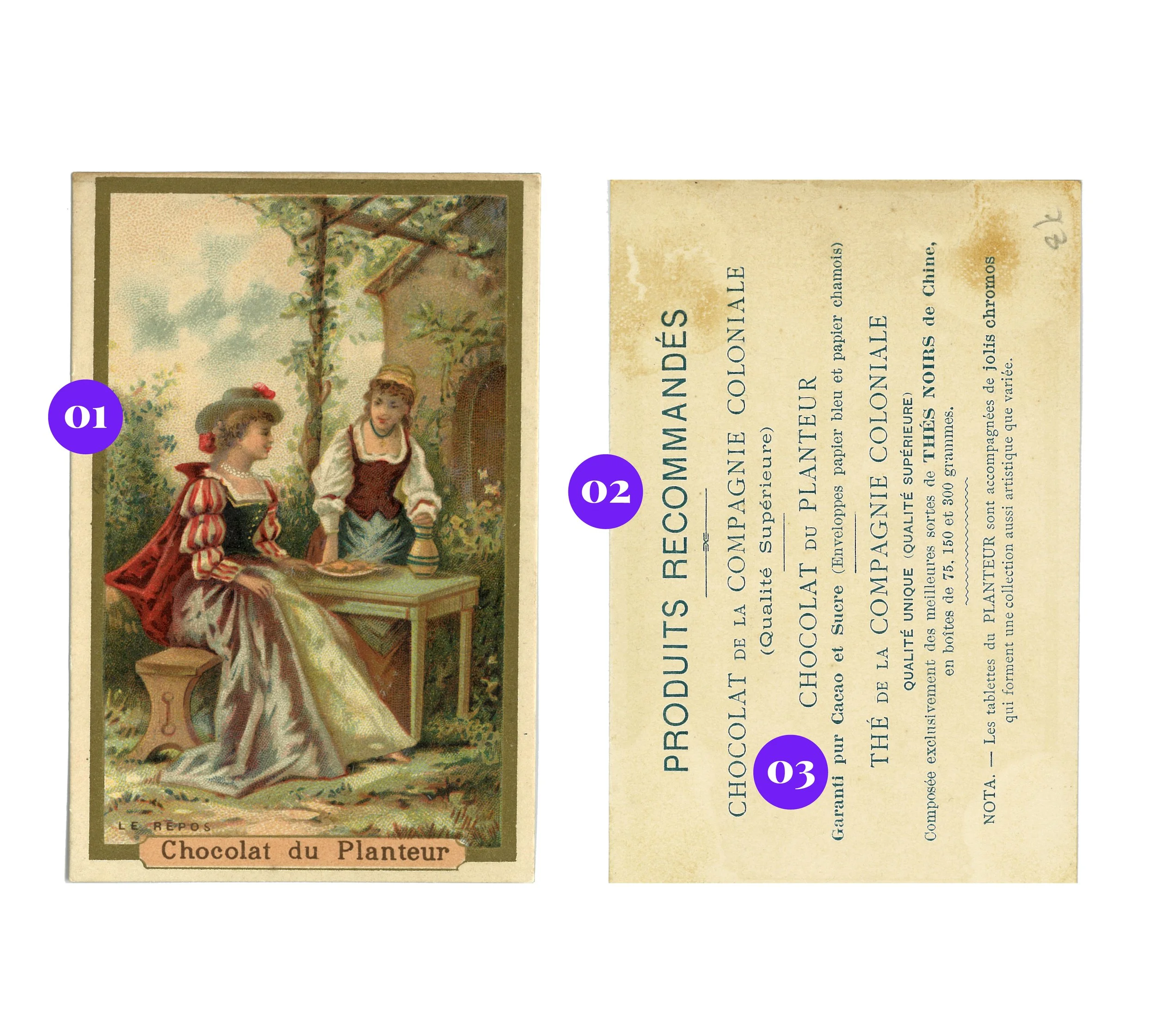
Le Chocolat du Planteur
1
The domestic scene. Two young women share chocolate on a leisurely day outdoors. A lifestyle image that sells comfort and connection, linking the product to emotion.
2
A sweet gateway to everything else. Listing their full product line (not just chocolate) served as an early cross-promotion strategy to attract more customers.
3
The art of language. As a simple lithograph, it leans on words rather than visuals to convey product craftsmanship and premium value.